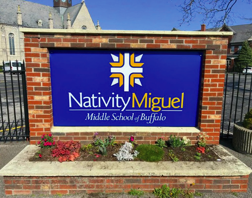
Nativity Miguel
Interior & Exterior Sign Package
Role
Concept development, visual system design, logo cleanup, photography selection, client proofs, material planning, fabrication and installation drawings, production files, and final quality control.
The concept
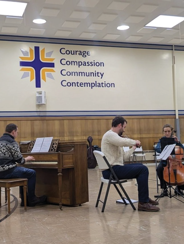
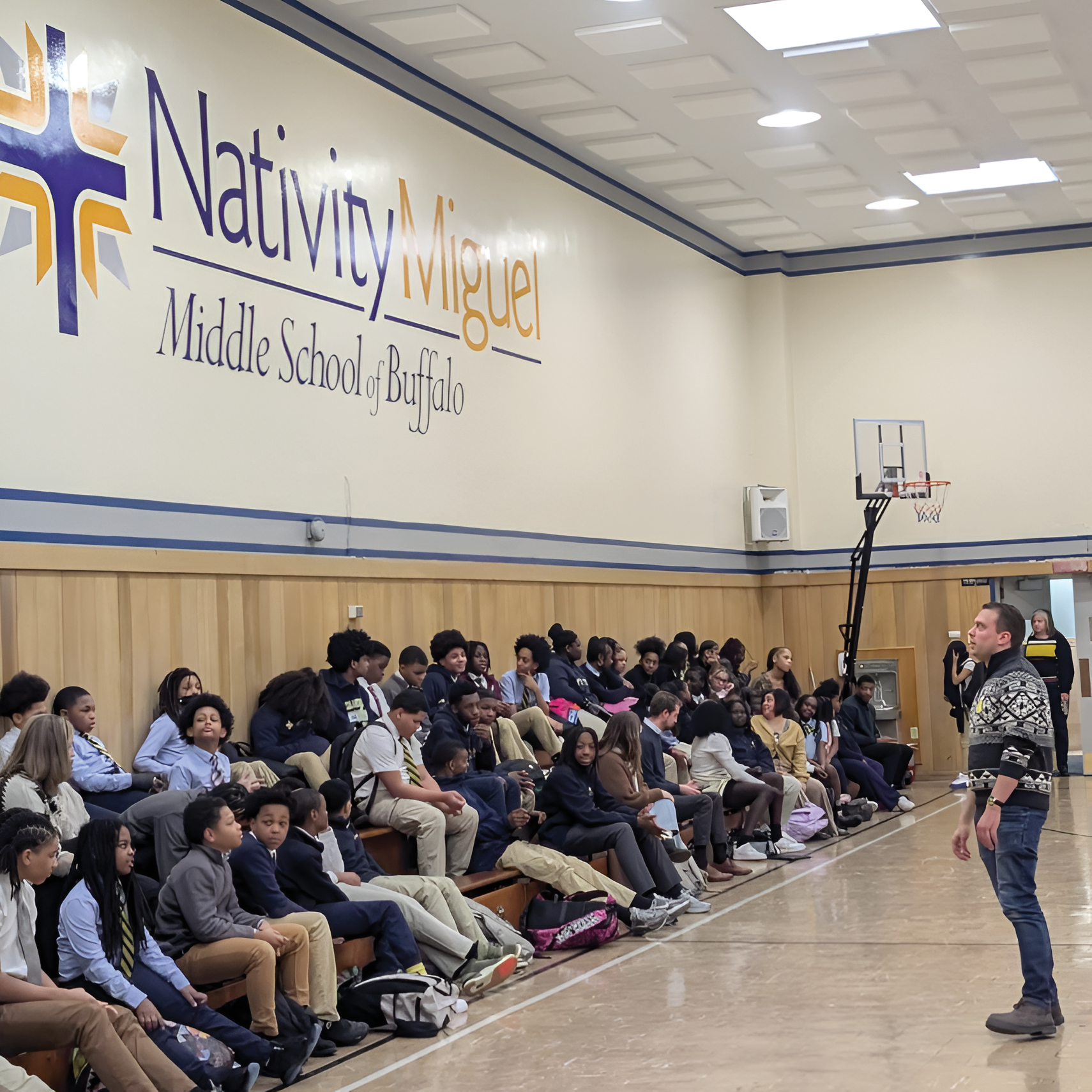
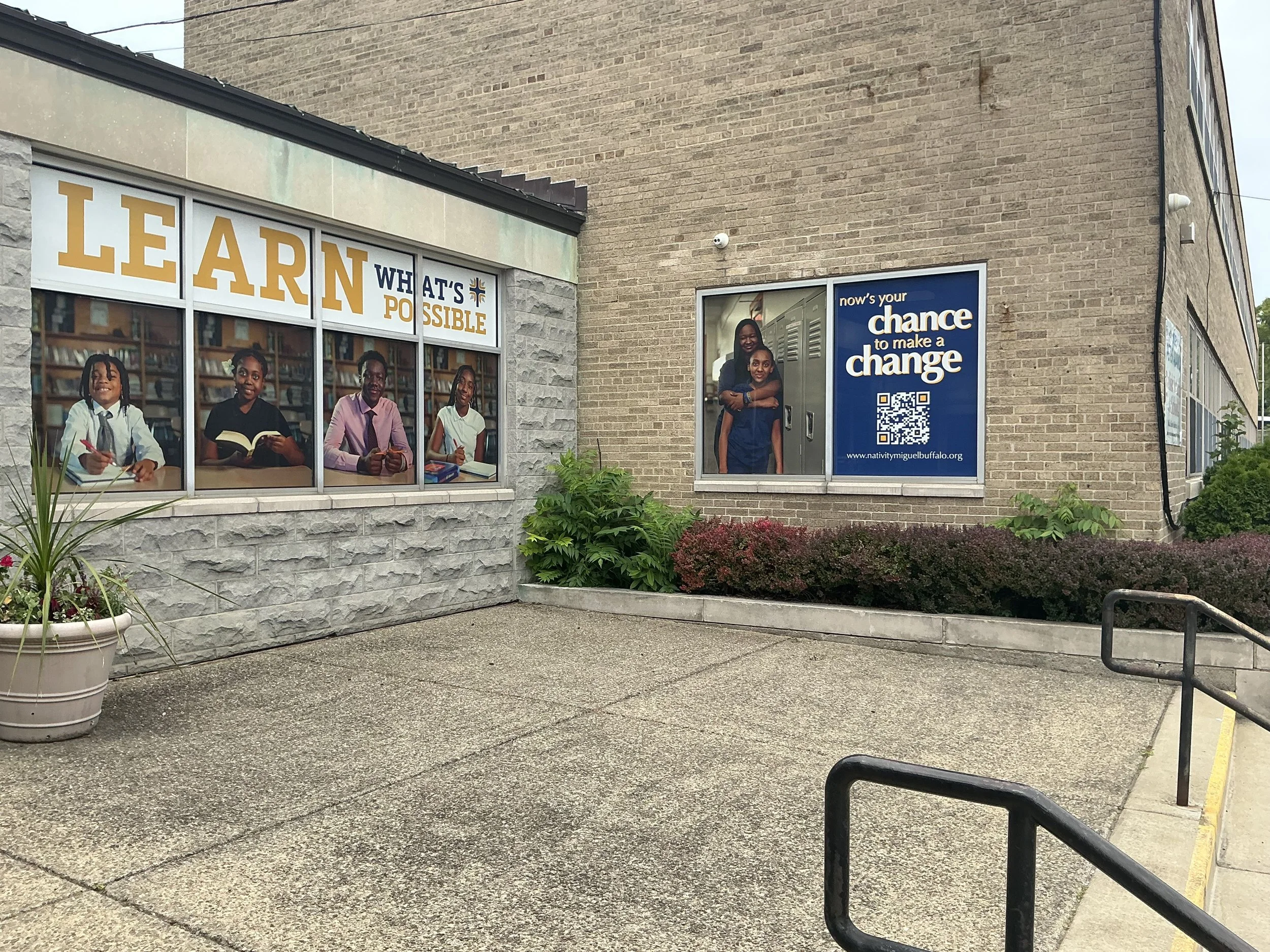
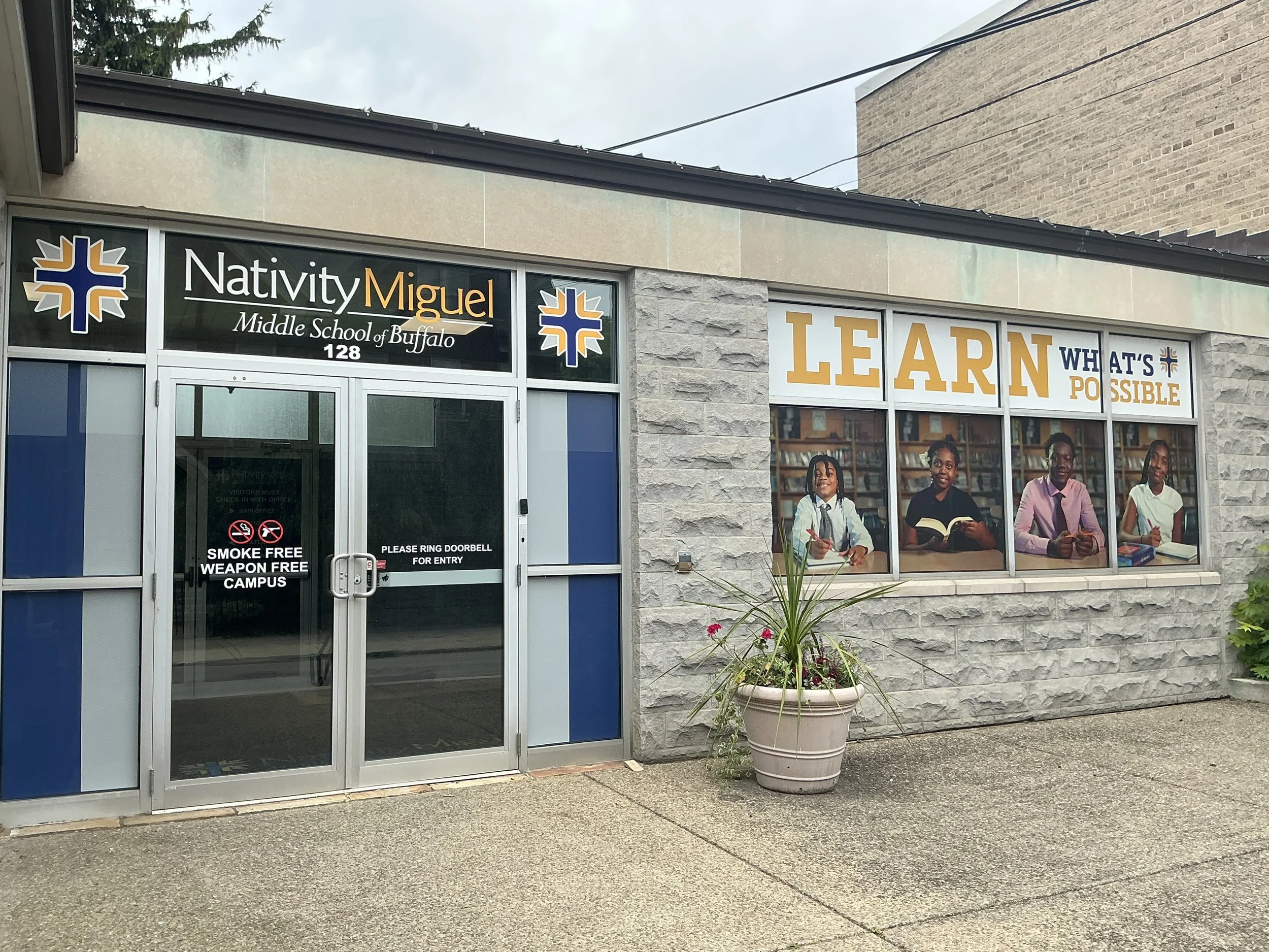
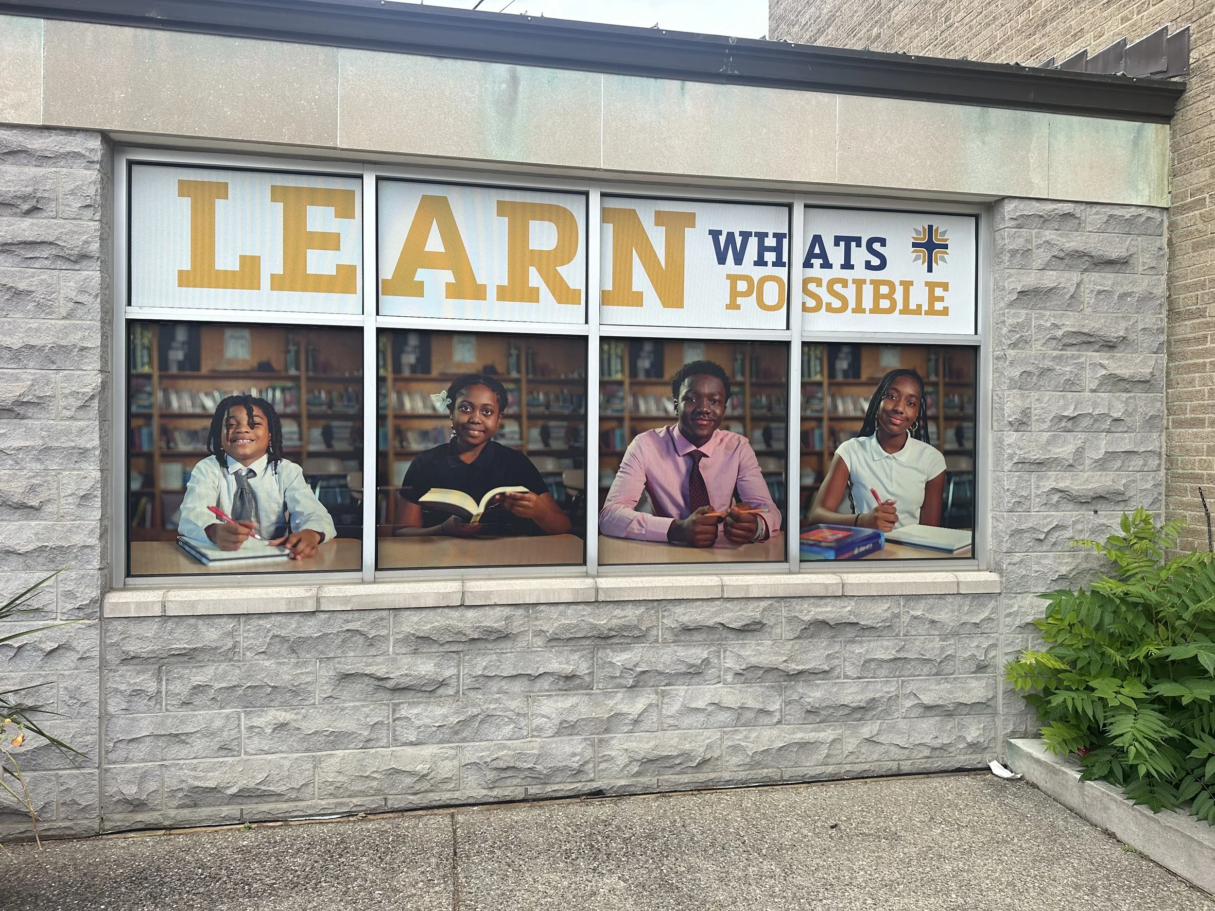
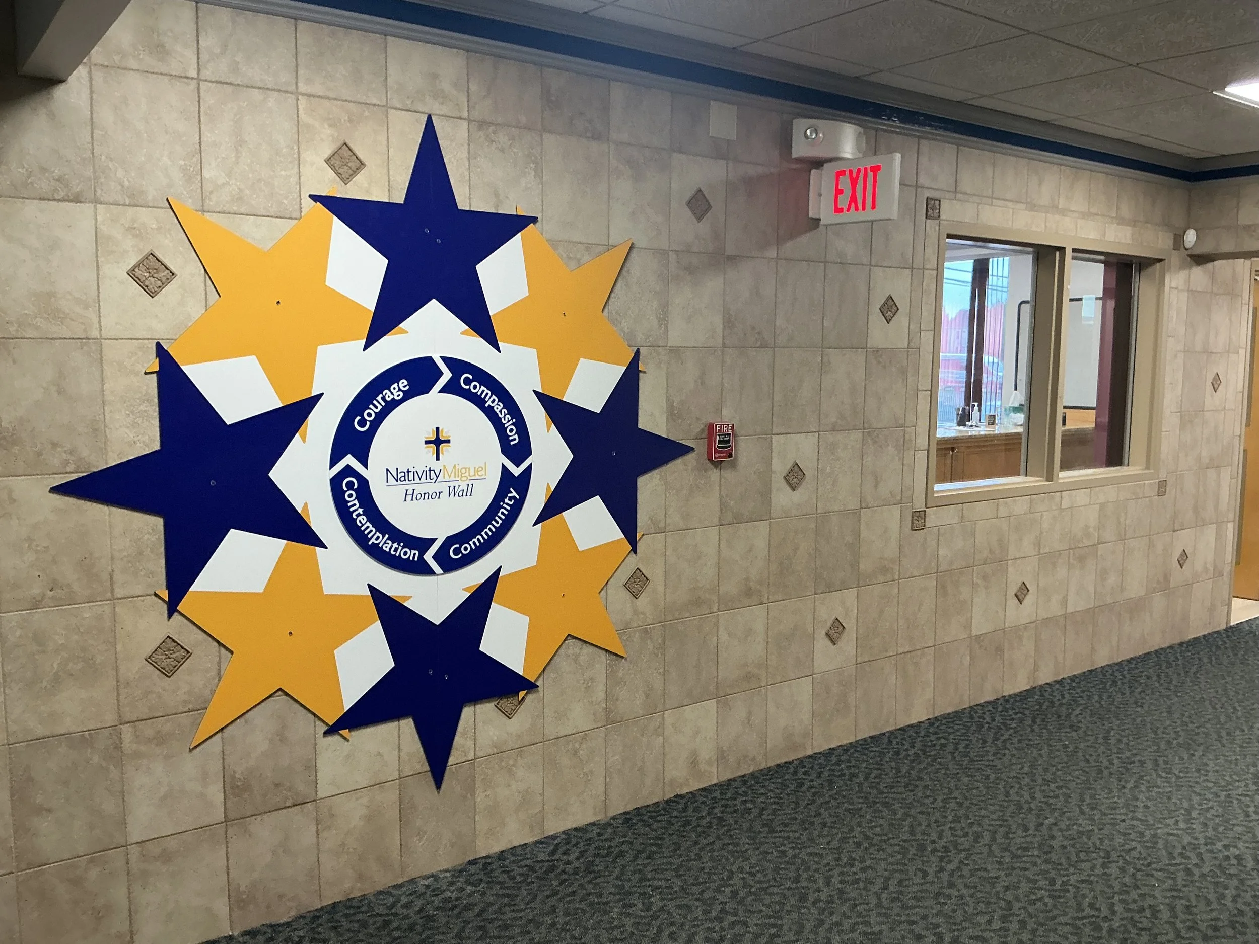
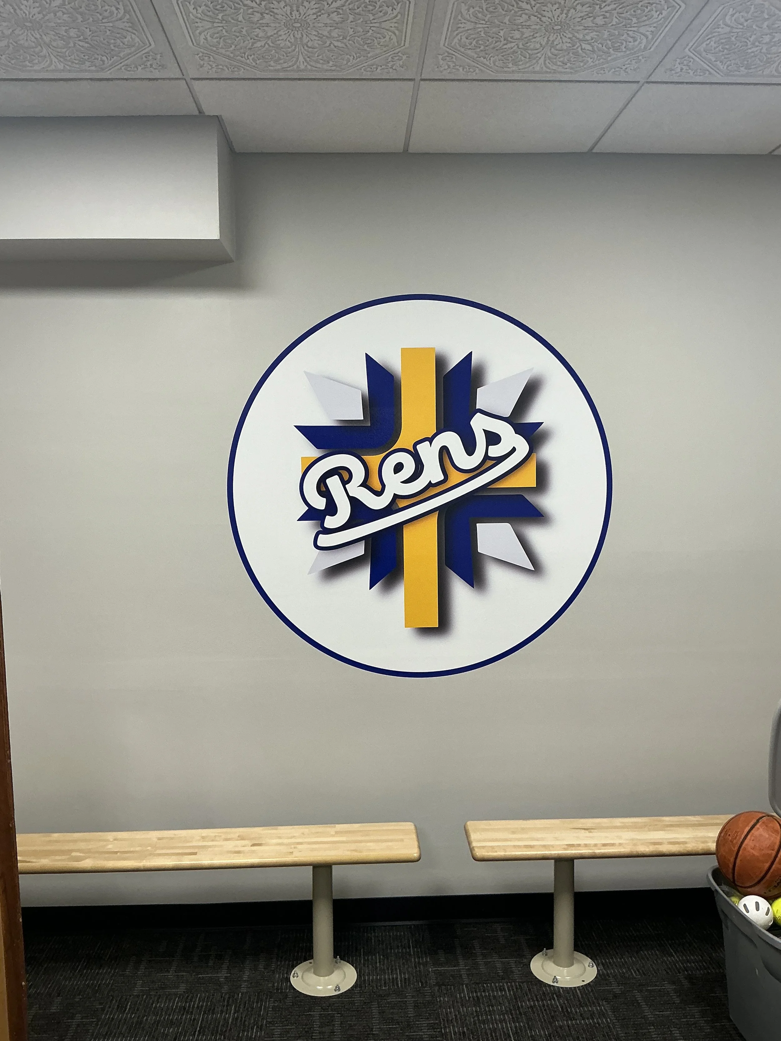
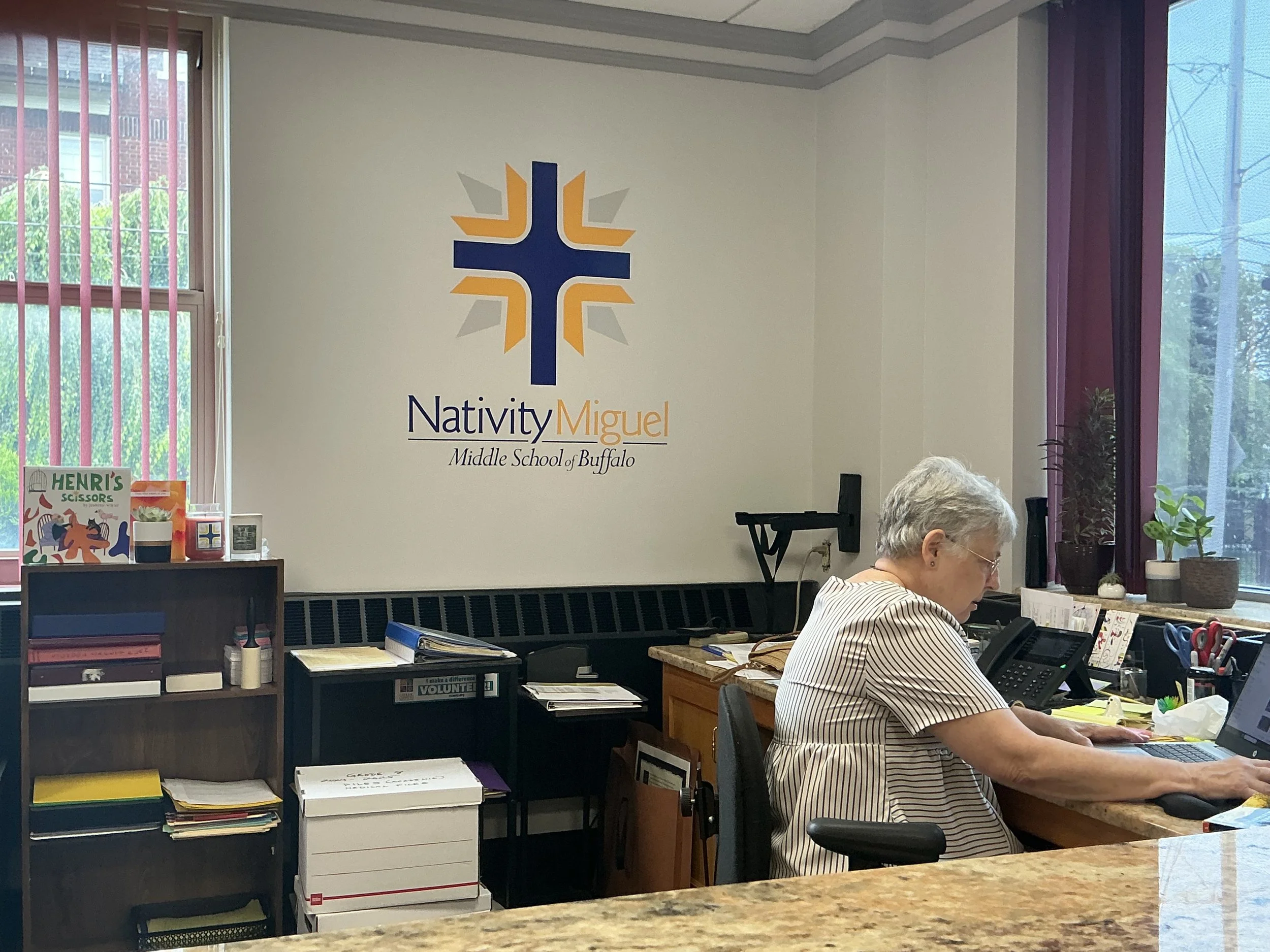
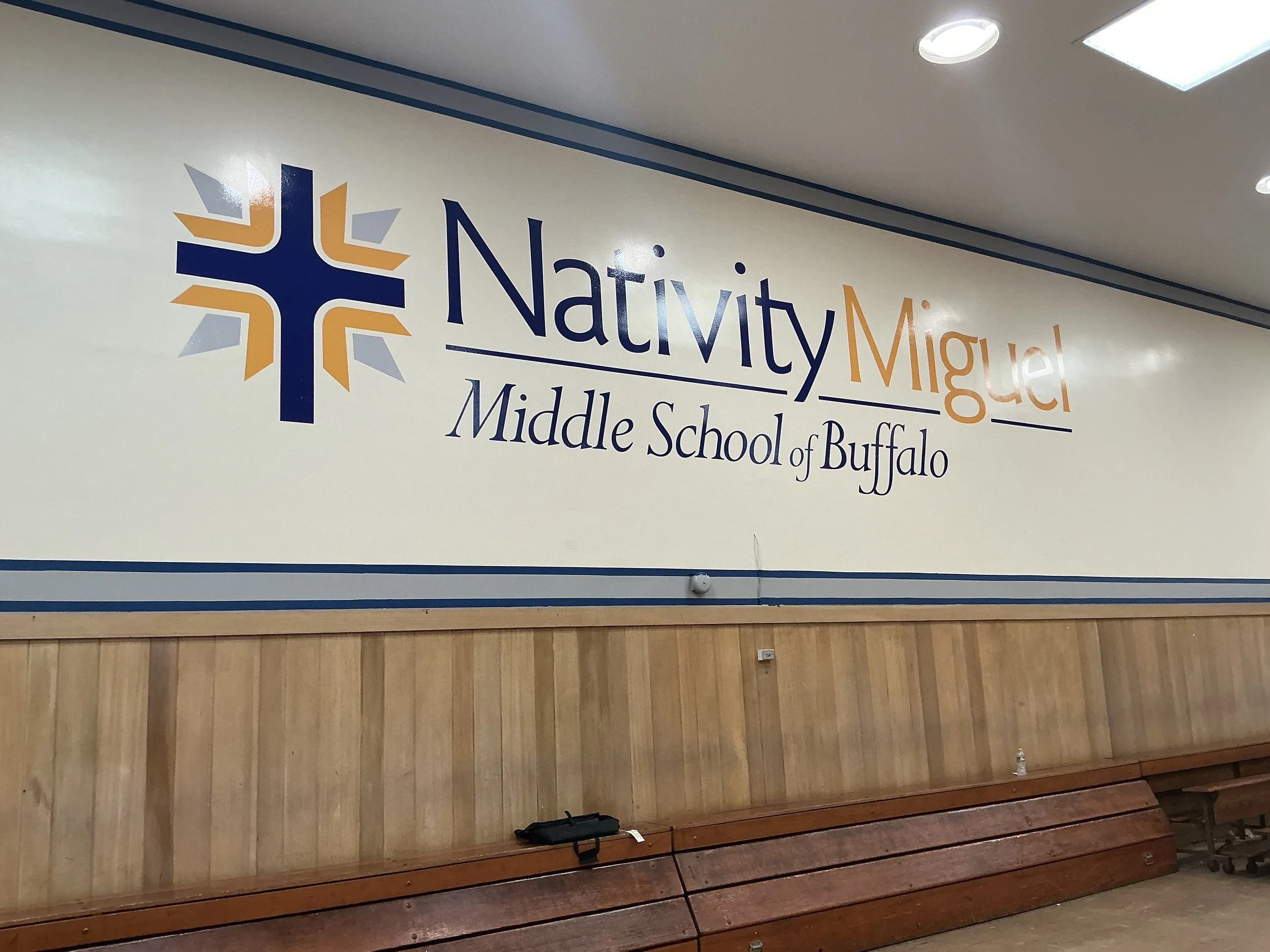
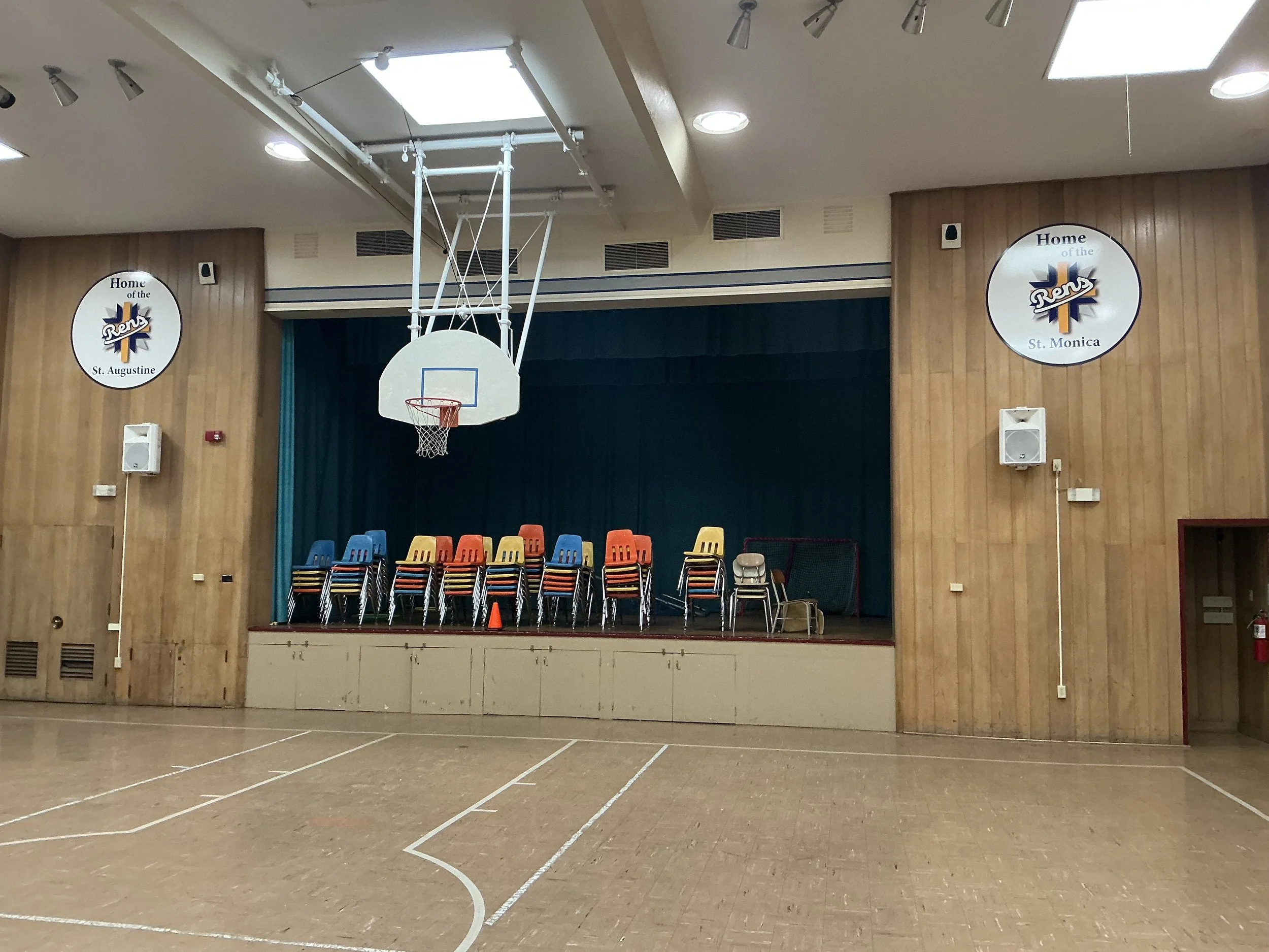
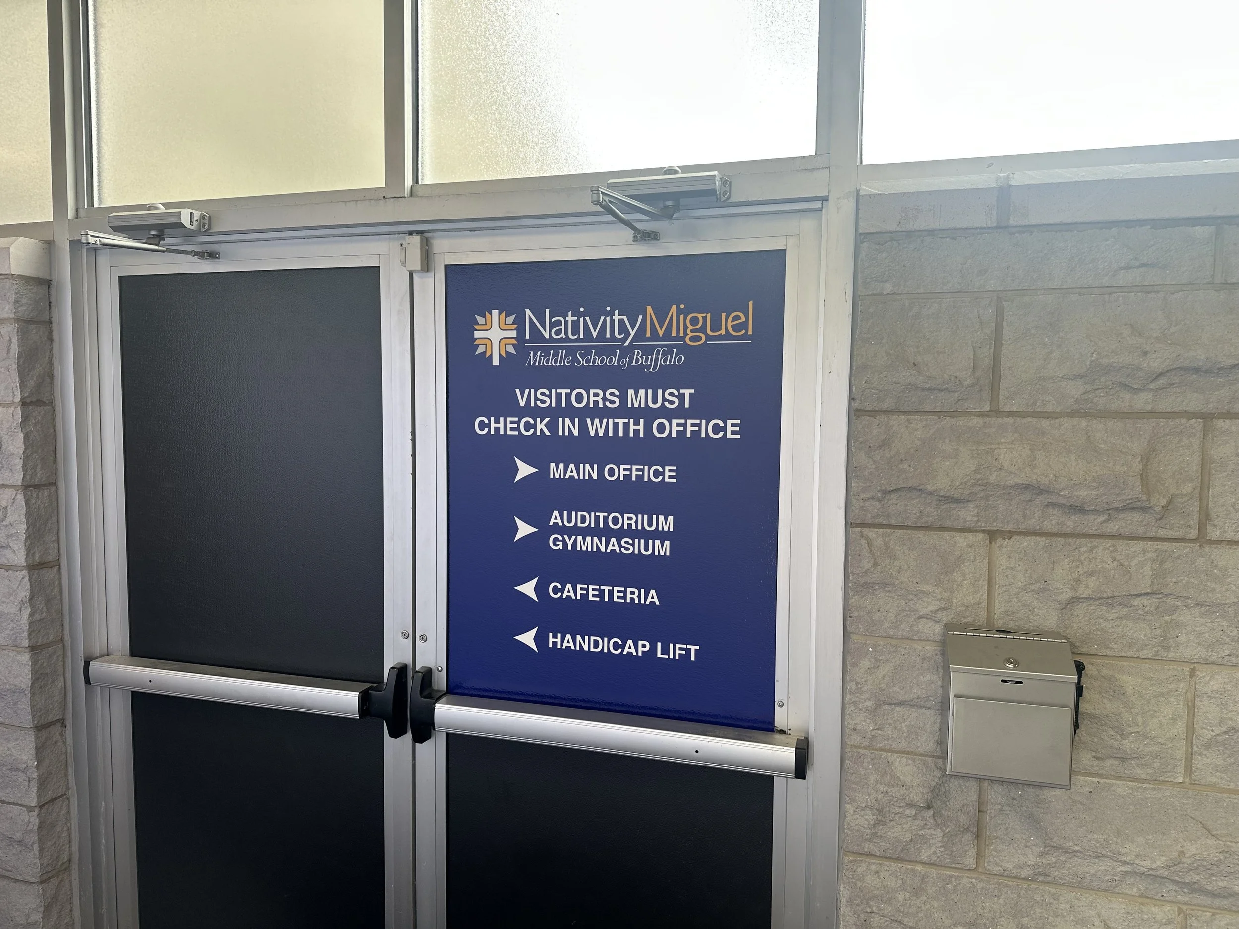
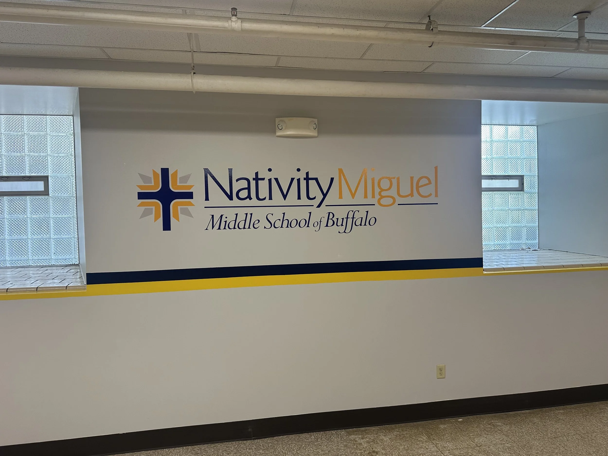
A coordinated environmental graphics system that transformed a repurposed church building into a recognizable Nativity Miguel campus. The school’s logo, colors, student photography, athletic identity, and four core values were carried across exterior identification, window graphics, interior branding, gym graphics, and a modular honor wall.
Process
Working from field measurements, site photographs, two existing logo formats, and no formal brand guide, I established consistent rules for color, scale, typography, and logo placement. I designed each application around its architectural space, revised the system when approved student photography became available, selected appropriate materials, and translated the final concepts into fabrication-ready artwork before reviewing the completed pieces for installation.
What I learned
A successful sign package needs hierarchy, not just matching colors and repeated logos. Each space had a different purpose, but every application still needed to feel like part of one system. The project strengthened my ability to build consistency from limited brand assets while designing around real materials, dimensions, production methods, and installation constraints.